

Most bad websites aren't obviously broken.
The logo shows up. The menu is there. The page loads eventually. On paper, it "works."
But as a visitor, something feels off. You don't quite trust the company. You hesitate to call or fill out the form. You hit the back button and keep looking.
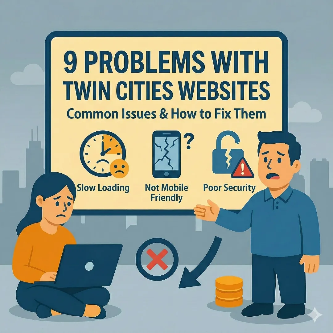
This guide breaks down the most common website problems we see when looking at Twin Cities business websites—from Minneapolis to St. Paul and across Minnesota—and more importantly, why they quietly kill trust and sales.
You don't need to be technical to fix most of this. You just need to understand how your site feels from the customer's side.
1. "I Have No Idea What You Do" in the First 5 Seconds
What this looks like
You land on a homepage and see:
- A big pretty picture with a vague line like "Solutions for a changing world"
- No clear mention of what the company actually does
- Maybe a slider with three more vague slogans
So the visitor asks: "Is this software? Consulting? Construction? Legal? Who is this for?"
Most people won't scroll to figure it out. They leave.
Why this is a real problem
If a stranger can't answer these two questions in five seconds:
- What do you do?
- Who do you do it for?
Then the rest of the site doesn't matter. They won't read your clever copy, case studies, or pricing page.
How to fix it
Look at the top of your homepage and ask yourself:
"If someone who has never heard of us landed here, could they repeat what we do in one sentence?"
If not, change your headline to something specific:
- "Custom websites for Twin Cities small businesses"
- "Web design and SEO for Minneapolis service businesses"
- "Family law attorney in Minneapolis focused on divorce and custody"
- "Commercial HVAC repair for the Twin Cities metro"
That one change alone improves conversions more than any fancy animation.
2. Pretty But Exhausting: Bad Layout and Visual Hierarchy
What this looks like
- Three different fonts fighting for attention
- Random bolded lines and buttons that all look "important"
- No clear path for the eye to follow
- Everything is centered, big, and loud
The site might look "modern" at a glance, but using it feels like trying to read a flyer that's been designed by a committee.
Why this is a real problem
People scan. They don't read.
If your layout doesn't clearly show:
- What this page is about
- What's important
- What to do next
You're making visitors do mental work. Mental work online feels like friction. Friction kills trust and patience.
How to fix it
You don't need design theory. Use a simple structure:
- One clear headline
- One short supporting line
- A clear button
- Then a simple section flow: problem, solution, proof, next step
Make sure headlines are obviously bigger than body text, there's one main button style for important actions, and you leave enough white space so the page can "breathe." If everything looks important, nothing is.
3. Navigation That Feels Like a Maze
What this looks like
- Huge menus with 10–20 items
- Drop-downs inside drop-downs
- Important pages like "Contact" or "Pricing" buried in the footer
- Mobile menu that turns into a long scroll of tiny links
If a visitor has to think about where to click, your navigation isn't doing its job.
Why this is a real problem
Navigation isn't where you "show everything you do." It's where you help people find what they came for.
When someone is lost:
- They can't compare your services
- They can't find proof you're legit
- They give up before they ever see your best content
How to fix it
Think in terms of a short list, not a sitemap. Your main menu should usually have:
- Home
- Services (or What We Do)
- About
- Resources or Blog (if you use it)
- Contact
If you have many services, group them on a "Services" page with clear sections instead of cluttering the top menu. On mobile, test your menu yourself—if you have to scroll a lot or pinch and zoom to tap a link, simplify it.
4. Content That Says Nothing Concrete
What this looks like
You've seen this a hundred times:
"We are passionate about delivering innovative solutions that drive value for our clients."
This could be on a Minneapolis law firm, a Twin Cities roofing company, a tech startup in the North Loop, or a dog groomer in St. Paul. It tells the visitor nothing.
Why this is a real problem
Vague copy hides weak thinking.
If you can't explain what you do, who you help, and how—in plain language—people assume you're either not confident or not focused.
How to fix it
Go through your main pages and ask:
- Could a teenager understand what we do from this page?
- Could someone repeat it to a friend accurately?
Replace fluff with specifics. Instead of:
Before:
"We help businesses grow."
After:
"We design and build fast, modern websites for Twin Cities service businesses so they get more leads from Google and referrals."
You want visitors to think: "Oh, that's me."
5. Forms and Contact Options That Feel Risky or Annoying
What this looks like
- Long forms with 10–20 required fields
- No idea what happens after you submit
- No confirmation or "thank you" message
- Phone number hidden or missing
- Email only visible as an image or behind some weird interaction
Visitors worry about two things:
- "Is this worth my time?"
- "What are they going to do with my information?"
Why this is a real problem
If your only contact path feels like a black hole, a lot of people won't bother.
Or they'll leave and call someone whose site gives a clearer expectation: who will contact them, when, and how.
How to fix it
- Cut your form fields down to what you truly need to respond
- Add a short line that explains what happens next:
- "We usually respond within one business day."
- "We'll email you with a few questions and set up a call if it makes sense."
- Show your phone number clearly if you actually answer it
- Make sure the form works on mobile and is easy to fill out
You're not trying to qualify everyone upfront. You're trying to start a conversation.
6. Slow, Heavy, and Distracting Websites
What this looks like
- Big background videos that don't add meaning
- Huge uncompressed photos
- Pop-ups layered on top of each other
- Chat widgets, notification bars, and sticky banners all fighting for attention
The site technically loads, but it feels sluggish and noisy.
Why this is a real problem
People don't separate "site is slow" and "business is slow." It all blends together into "this feels annoying."
Google also uses performance as a ranking factor. A site that's heavy and slow gets buried, especially on mobile. Learn more about how this affects your search rankings in our complete guide to website optimization.
How to fix it
You don't have to be a developer to improve this:
- Compress your images before you upload them
- Remove videos that don't serve a clear purpose
- Don't stack multiple pop-ups and bars
- Ask your developer to audit unused plugins or scripts
The site should feel snappy. If you tap a link and it stutters or hangs, that needs attention.
7. Terrible Mobile Experience
What this looks like
- Tiny text that forces people to pinch and zoom
- Buttons too small to tap without misclicking
- Sticky elements (like chat bubbles) covering important content
- Forms where the on-screen keyboard hides the field you're typing in
For a lot of businesses—especially local and service-based—most traffic is mobile. Yet the mobile version of the site feels like an afterthought.
Why this is a real problem
If someone in Minneapolis is looking up your business from their phone in a parking lot or on their couch—and your site is painful to use—they will choose someone else.
How to fix it
- View your site on your own phone and pretend you're a first-time visitor
- Try to find your main service, read it, and contact you
- If anything feels fiddly or cramped, fix that first
At minimum: text should be readable without zooming, buttons should have comfortable padding, and forms should be easy to fill out on a phone.
8. No Trust Signals Where They Matter
What this looks like
- No testimonials or reviews
- No examples of past work
- No clear location or service area
- An "About" page that's just a paragraph of fluff
- Copyright year that's five years out of date
Visitors think: "Is this business real?" and "Can I trust them with my money or my problem?"
If your site gives them no proof, they fill in the blanks with doubt.
Why this is a real problem
You might be great at what you do. But online, people only know what you show them.
If you look less real or less established than your competitors, they win the lead—even if you're more qualified.
How to fix it
You don't need a huge portfolio:
- Add 3–5 short testimonials
- Include logos or names of companies you've worked with (if allowed)
- Add a short, human "About" section with your name, location, and why you do what you do
- Clarify your service area—do you serve all of Minneapolis? The entire Twin Cities metro? Just the south suburbs?
People want to see that there's a real person or team behind the site. If you're a Twin Cities business, make sure you're optimizing for local search too—see our Minneapolis SEO guide for specifics.
9. No Clear Next Step on Any Page
What this looks like
- Informational pages with no call to action
- Service pages that end with "Contact us" and nothing else
- Buttons that say "Learn more" but don't tell you why
Visitors should never be asking themselves: "What do I do now?"
Why this is a real problem
Every page should have a job:
- Educate
- Compare
- Build trust
- Get someone to start a conversation
If the page does its job but doesn't clearly show what to do next, you lose many people who were willing but not guided.
How to fix it
For each important page, decide: What should the visitor do if they're interested?
Then add one clear call to action:
- "Request a quote"
- "Book a free consult"
- "Send us your project details"
It should be specific and visible without scrolling a mile.
How to Use This as a Beginner
You don't need to fix everything at once.
If you're just starting, here's the order I'd tackle:
Fix Your Homepage Headline
Make it immediately clear what you do and who you help. This single change improves conversions more than any fancy animation.
Clean Up Your Navigation
Remove clutter. Keep it to 5-7 items max. Important pages like Contact should be easy to find.
Rewrite Vague Content
Replace corporate fluff with plain language. If a teenager couldn't explain what you do from your site, rewrite it.
Simplify Your Contact Path
Cut form fields to what you actually need. Tell people what happens after they submit.
Test on Your Phone
View your site on mobile and try to find your main service, read it, and contact you. Fix anything that feels fiddly.
Even those changes will make your site feel very different to real people. And that's the whole point.
Quick Self-Assessment Checklist
Use this to audit your own site in 10 minutes:
Website Trust Checklist
Look at your homepage headline. If it says something vague like 'Solutions for a changing world,' rewrite it.
5-7 items max. No drop-downs inside drop-downs. Contact should be obvious.
Replace 'We help businesses grow' with exactly what you do and who you help.
Only ask for what you need. Tell people when you'll respond.
Text readable without zooming, buttons easy to tap, forms easy to fill out.
Testimonials, past work examples, real location, updated copyright year.
Each page should tell visitors exactly what to do if they're interested.
Related Guides
Want to dig deeper into specific topics?